Oh, that’s nice that.

Wine, Dine, and Design 🍷👩🏻💻
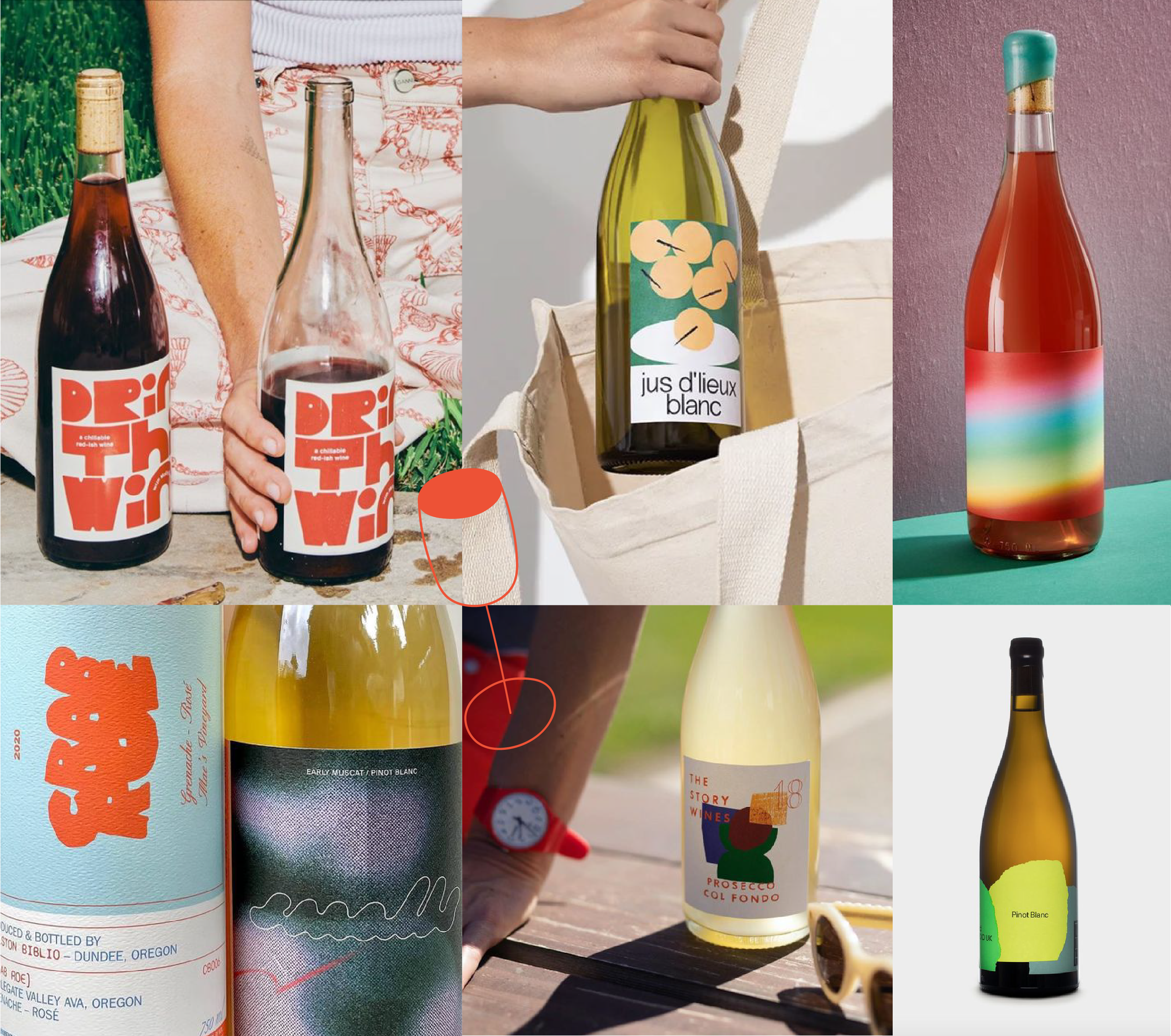
I am far from being an oenophile (the fancy word for a lover or connoisseur of wine). Still, I am enthralled by unique wine labels - specifically, natural wine labels due to their playful designs. I’m naturally drawn to color and texture and will, more often than not, grab a bottle based on the label alone, as a graphic designer does.
Judging by the cover 📚
Wine labels have always played an essential role in selling a bottle due to the barriers to education in the wine industry. Does it look expensive? Where is it from? When was it made? Walking into a natural wine shop, you‘ll come across various hand-drawn illustrations, experimental typography, and lucid colors that typically go against the high-brow traditions of the wine industry. With their more approachable designs, it’s no wonder natural wine has increased in popularity.
A shoppy shop I always return to is Vin on Rose, filled with a great selection of wines guaranteed to have unique labels, and if I am looking beyond the brand, the knowledgeable staff has started me wrong.

I love the organic shape labels Apartmento Studios designed for Vivanterre – so simple yet has a significant impact when browsing wine based on aesthetic.

Katy Perry’s De Soi, a non-alcoholic option, uses colors and playful shapes to create an inviting brand.
Implementation 💁🏻♀️
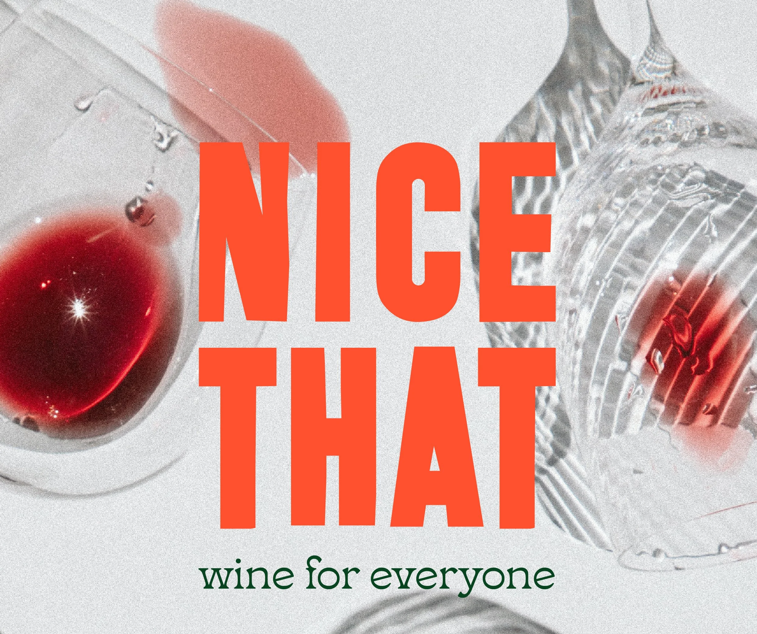
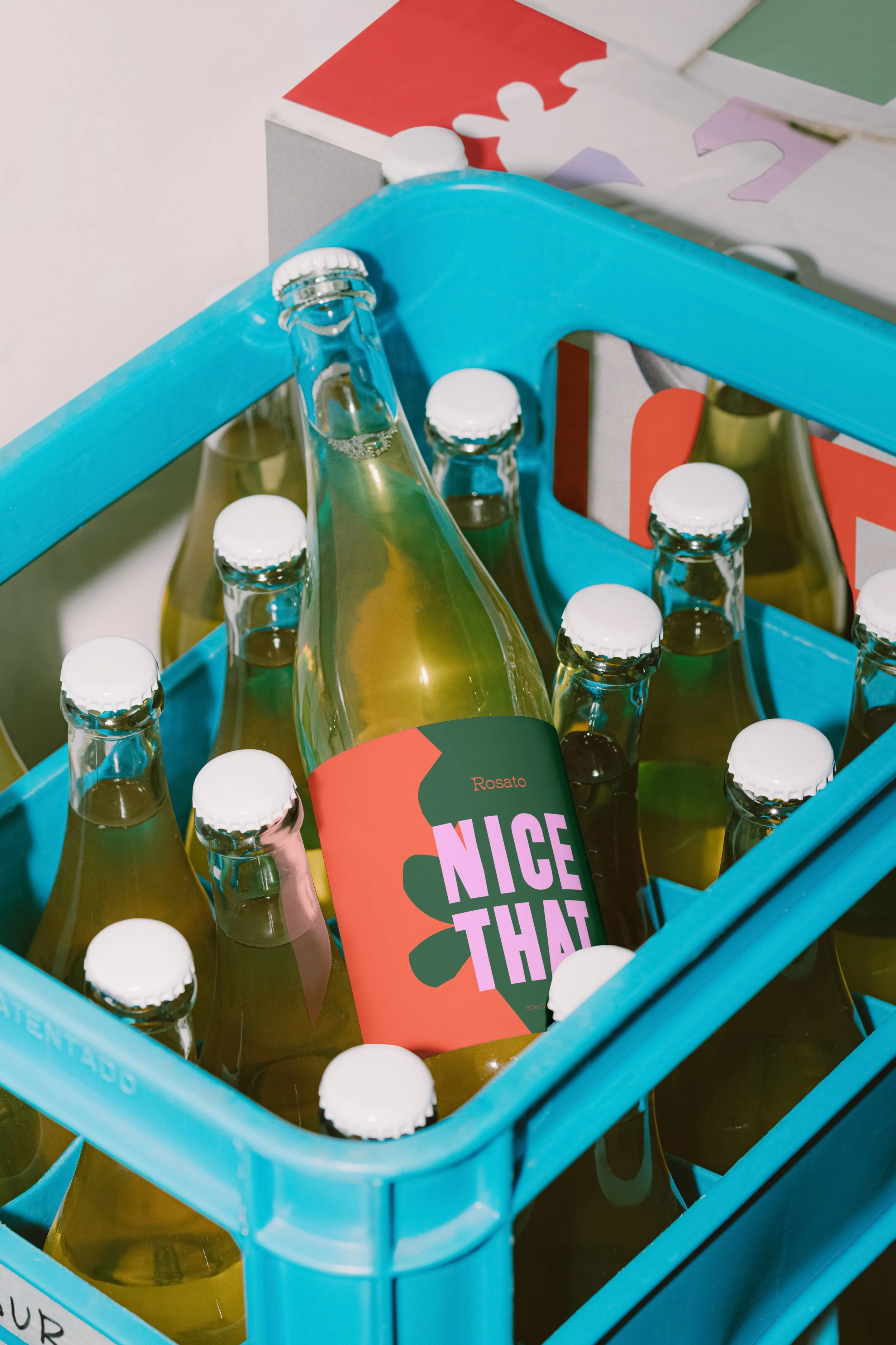
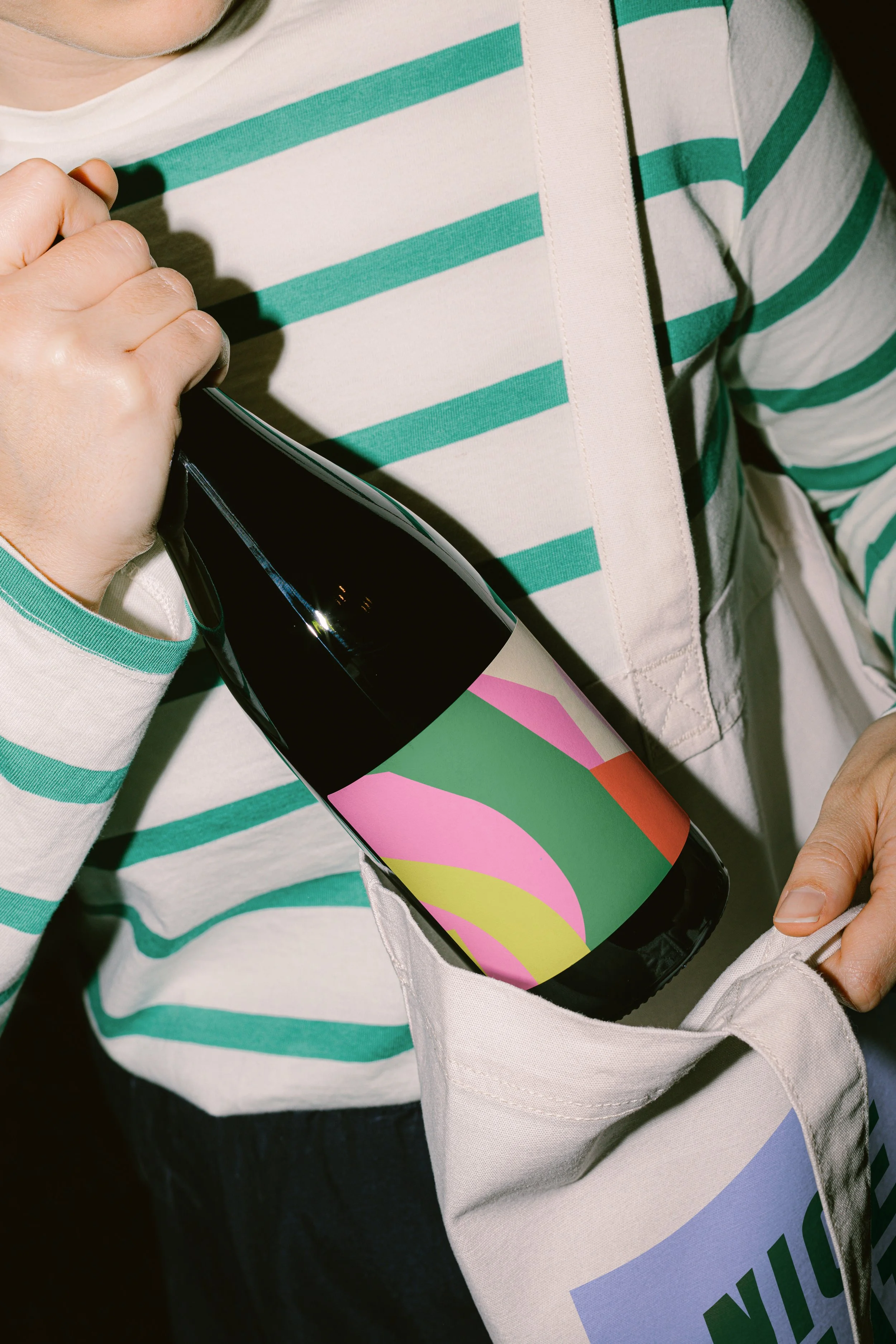
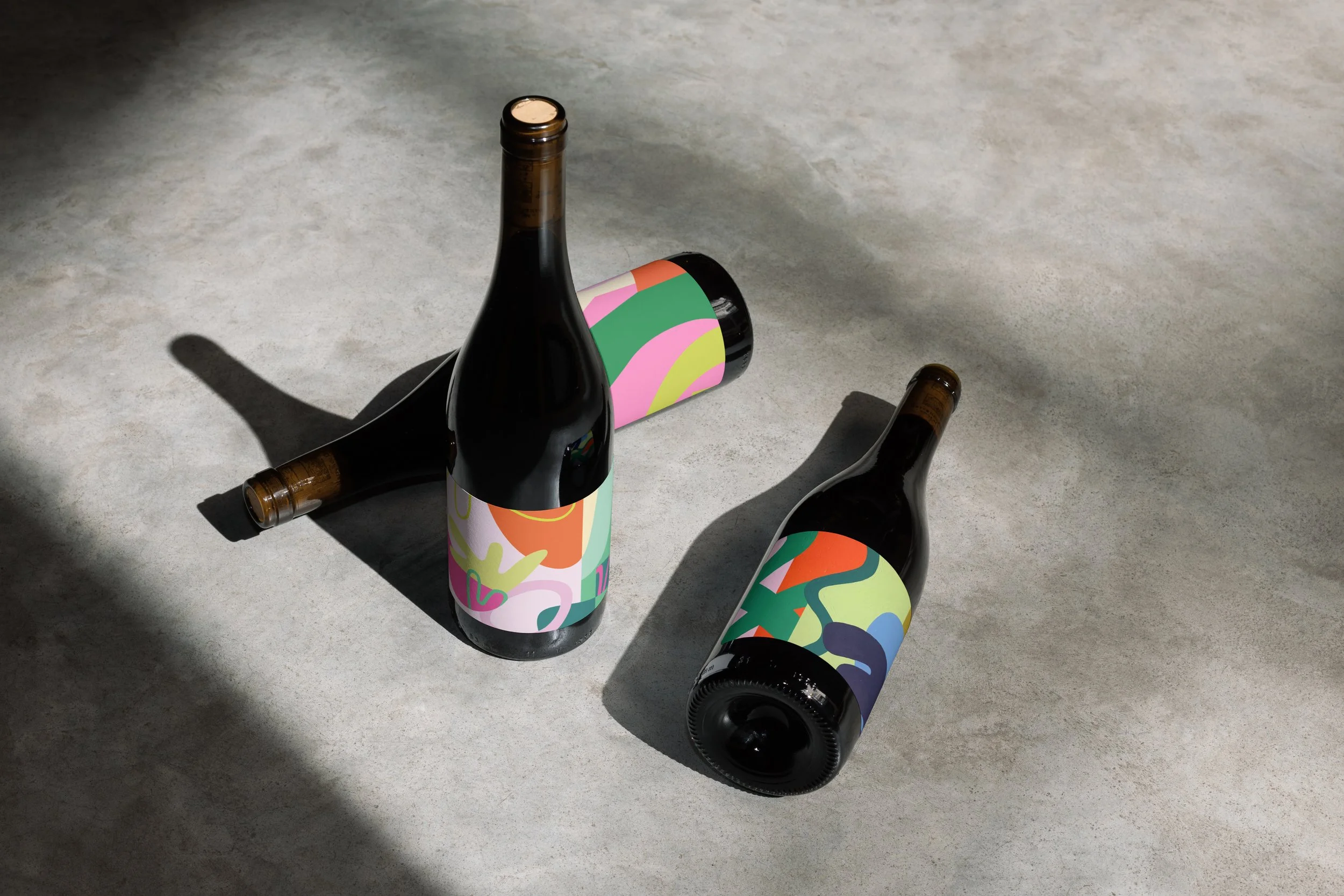
A dream of mine is to collaborate with a winery, using my art to design colorful collaged labels. In my downtime, I have been working on a passion project to develop a concept brand called “Nice That,” inspired by what one would say after their first sip of wine.
Mood board
Logo and color palette
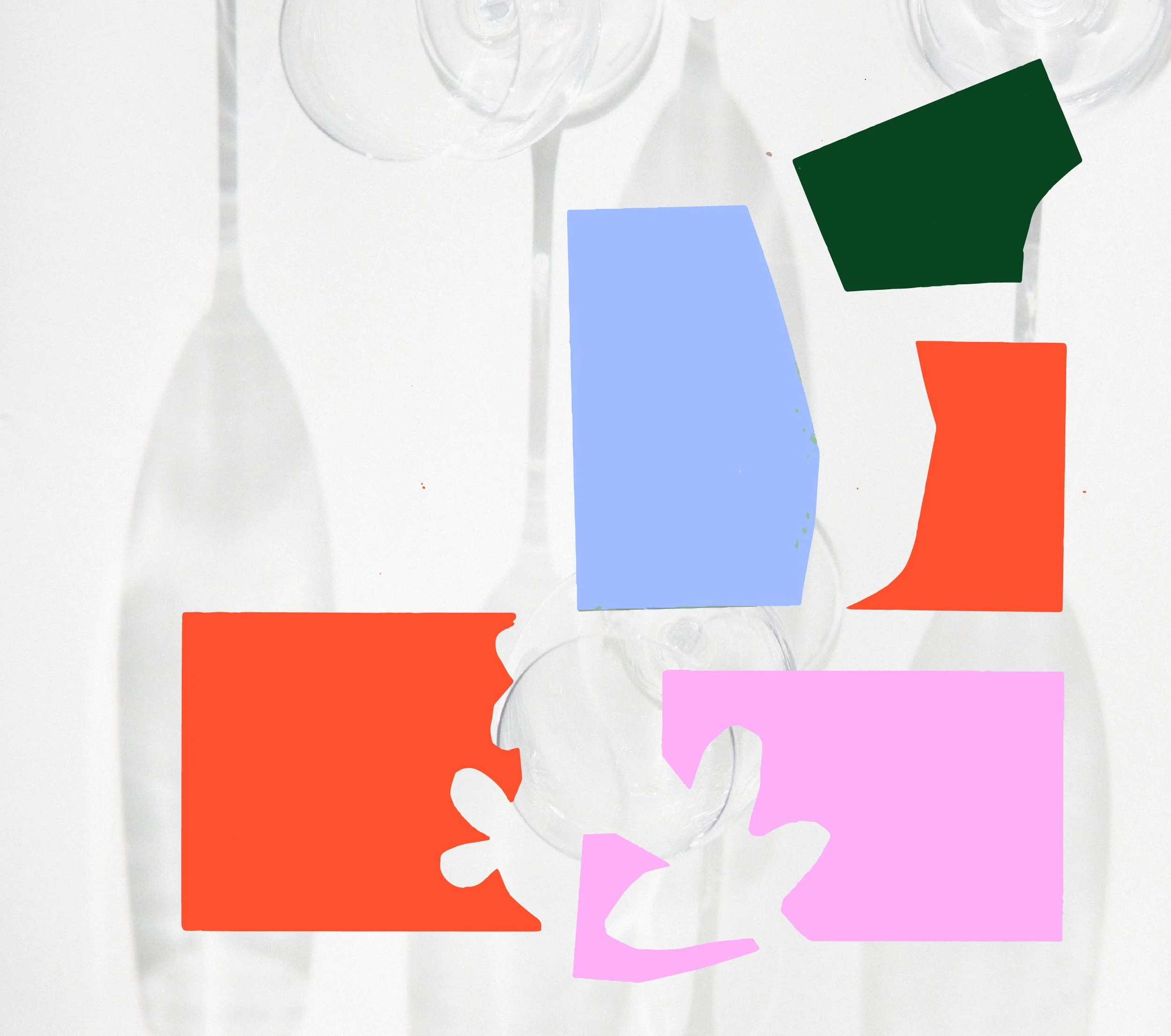
Collage shapes